5 Reasons to use Blank Template in Emails on Mautic

Whenever I am asked about the structure of an email, whether it is a newsletter, a communication or a simple transactional email, I come across some dilemmas about layout, composition, usability and so many other items that should be addressed and the Blank Template always helps my decision.
In this
Is your email compatible with the major email clients?
According to the litmus report after monitoring more than 1.2 billion emails in April 2018, iPhone's email client continues to be the lead followed by Gmail and the native iPad customer. Incredibly Outlook has less
With this data in hand based on the North American scenario where Apple and Gmail are the predominate email clients, the question is: Is your email compatible with these main email clients?
For those who answered yes, review these small items:
- Have you changed the font family of your email? Remember that most users customize the size, weight, and font family of email clients. You are overwriting this preference.
- Are you setting up your email thinking about mobile? Remember that simple, well-formatted email follows the email client rendering pattern. Do not force the bar.
- Are you using unsubscribe links as required by Brazilian law? Remember that many providers bar emails that do not have the possibility of unsubscribing.
These 3 items are essential for meeting compatibility benchmarks of your email. Do not overlook these points in overly complex email designs. We recommend the Blank Template because by default the Blank Template takes care of these items for you ????
Mautic's native Blank Template centers content and applies a 600px layout to content. If you do not want this layout with 600px you can use our alternative layout that removes 100% of the default layout of the blank theme.
Download the New Blank Theme
Remove all default Mautic mail formatting with this exclusive theme developed by Powertic!

Do you know how Outlook and Outlook.com work? Blank Template knows!
Many email systems do not pay much attention in Outlook. The mautic Blank Template is compatible with several Outlook standards and if I were you, I would think twice before abandoning it. But if you are not aware of the limitations of Outlook, I suggest that you write down the following items in your personal checklist:
- Background images are not supported in DIV and TD (cells)
- Float or Positions are not supported through CSS
- Shadows are not supported in text (still good, right?)
- Unreliable and inconsistent support for margins and paddings
- Even more precarious support for Width and Attura through CSS
- Problems with Backgrounds in general
Yes, Outlook is not capable of most items that
Stay tuned with image lock
While Google now allows images from safe environments to appear automatically, the latest versions of Outlook for Windows and Mac block images by default. Therefore, it is advisable that you try to write consistent and useful ALT attributes if your images are blocked.
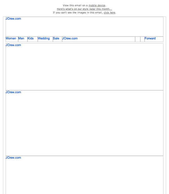
Here is an example of an email where the images have been blocked and nothing can be accurately viewed, making the email unreadable:

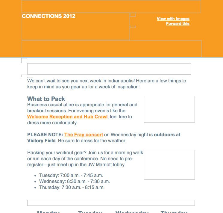
Now with a little more care, you can compose emails with over 70% text so that if your images are blocked your message is consistent and does not detract from the user experience. Look:

Mobile Compatible Buttons
The Mautic Blank Template provides 3 button sizes that are fully compatible with mobile devices. Nothing is more annoying than trying to touch a link and end up accessing the link on the side.
Preview Text
Since Mautic 2.8 where we can use a code widget in Email
<div style="display: none; max-height: 0px; overflow: hidden;">
Here the Preview</div>
<div style="display: none; max-height: 0px; overflow: hidden;"></div>
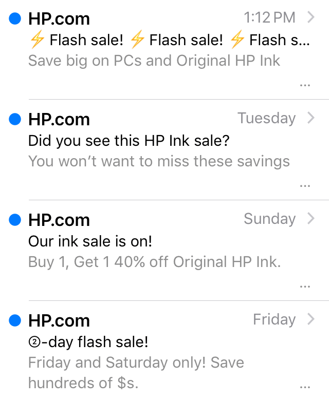
This way you get a lot of white space in the email preview. See this example:

Conclusion
I hope these 5 tips help your email marketing campaigns and allow you to clearly see the important benefits of using the Blank Template. ????


Thanks for sharing the email template! It works great and email now look more natural than with the default Mautic email blank template
Thanks for the “blank” template, I’d really like to use it, however, I’m having trouble finding where in Mautic to upload it? Can you advise? I’m using v2.15.3 .
Hey Brett,
I hope you have found it. Anyway, you have to go to themes on engine icon, first option on right menu.
Good luck